I sat down with Sandy at King’s Hill HQ to design a new bottle - something really special - and seeing the results now, I‘m super proud of what we achieved.
This is a fully custom produced bottle from start to finish, which is something I’m very lucky to have had the opportunity to do - it really does mean you can go after every detail.
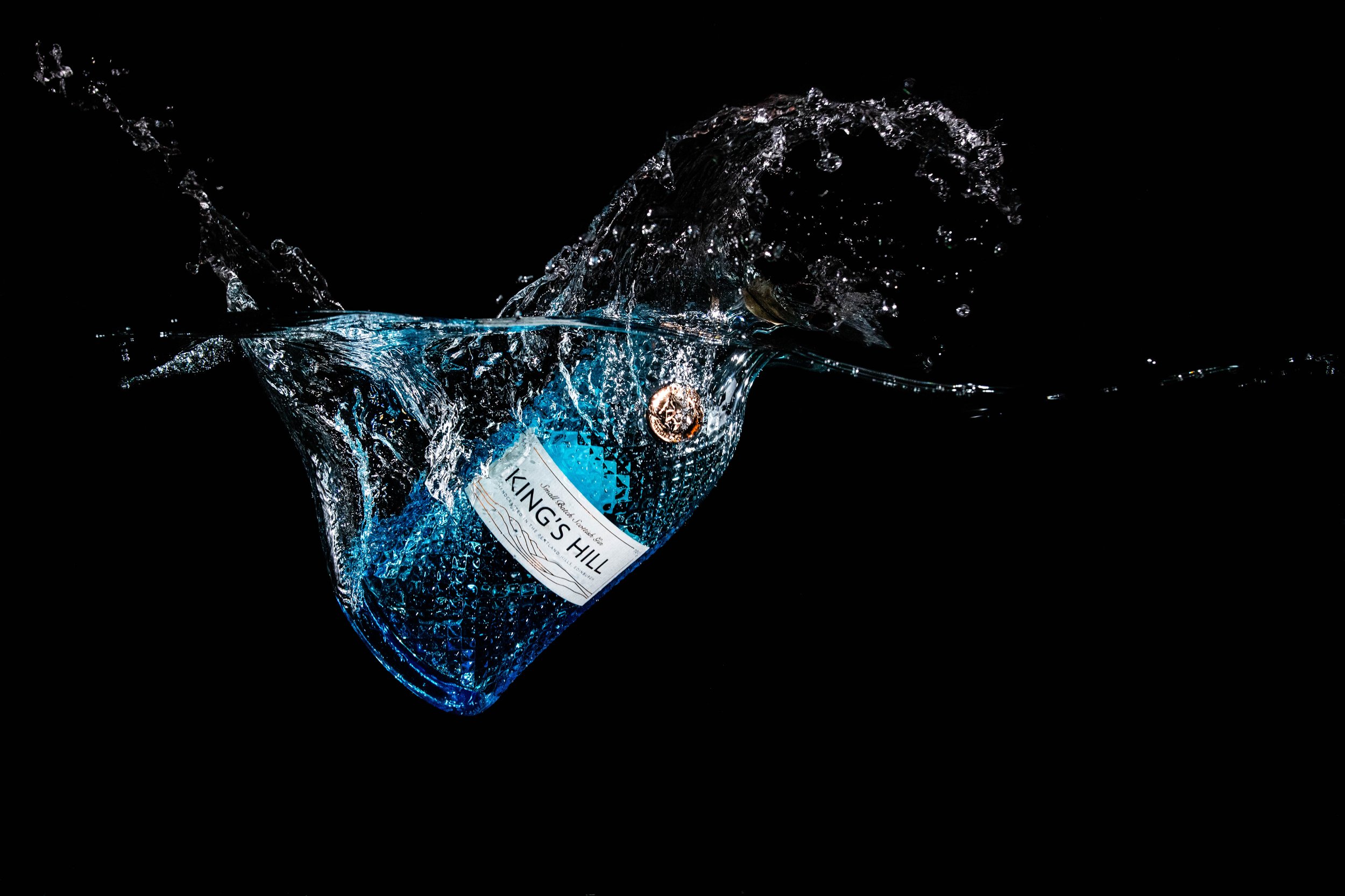
The copper ‘coin’ at the neck is a nod to the still in which the gin is produced, something also reflected in the copper foiling on the label (which also features the lines of the original bottle).
The King’s Hill blue is represented in the bottle’s colour fade, and the opulent diamond texture in the bottle reference the crisp, clean water of Glencorse - the reservoir which provides the water for the gin, and holds the run off from the fabled King’s Hill itself.
Needless to say the gin inside is every bit as beautiful as I think the bottle is, so if you’re a gin fan and haven’t tried it yet, this really is one you want to add to your collection.